Climate-optimised flight routes

Climate-optimised flight routes
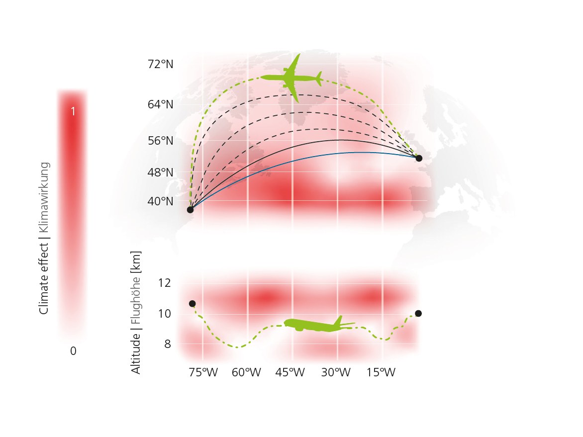
The two graphs show examples of how flight routes from Europe to North America can be made more climate-friendly. In the upper diagram, it can be seen that a much more northerly flight route (green dashed line) has a smaller climate impact than the shortest flight route (blue) and most cost-effective flight route (black solid line) to the south. The further north the flight path is shifted, the lower the climate impact (indicated by further dashed flight paths in between). The illustration below shows that a climate optimisation of the flight path can also be achieved by varying the flight altitude. The colour scale shows which areas have a comparatively high climate impact when an aircraft flies through them. The climate impact shown includes, for example, how extensive and long-lasting condensation trails are formed in certain regions. Illustration according to Lührs et al. 2018.